Interior Direct Lighting
This page is designed as a supplement to lectures. It is not intended to be a stand alone tutorial.
This demonstration showcases using arrays of point lights to create a rich sense of light and darkness in an interior space. The resulting renders can be very fast if shadows are not used extensively. The render times can be much shorter than with Final Gather, Ambient Occlusion and other indirect methods.
Achieving high-quality results comes from the careful placement of multiple lights. Setting up Maya so its easy to select and move lights while the IPR renderer immediately shows the render is important. The layout of Maya has been adjusted so the render view is actual size and the top, side and front views are smaller and in wire frame. In this example, many point lights have already been created and roughly positioned. Note their arrangement is very straight and orderly. You may find that you want to change that as you tweak. |
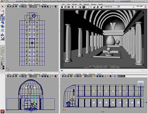 |
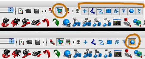
Its also helpful to setup Maya so you only select lights in the modeling windows. This can be done by staying in Object Select Mode, but turning everything off except lights. Right Mouse click on all the buttons to find which one is for lights. Turn off everything (as shown in the lower shot) with just the lights selected. Now it is very easy to pick one light, rows of lights, and move them. All the time the IPR updates the changes. |
 |
Create a Point Light. Turn decay to "Cubic". This is the most accurately depicts how light falls off over distance. Start duplicating lights to fill the space. The above screen layout shot shows how the lights were originally laid out. The first renders will be dark, because the decay rate is set to Cubic. You need to increase intensity of all the light. Remember that you can do this with the Attribute Spread Sheet - you select all the lights and can quickly change all the intensities at once. If you need a refresher, this tutorial goes over it in more detail, Exterior Direct Lighting. Depending on the size of your space and amount of lights, you can may have to crank intensity beyond 1000 - even more. |
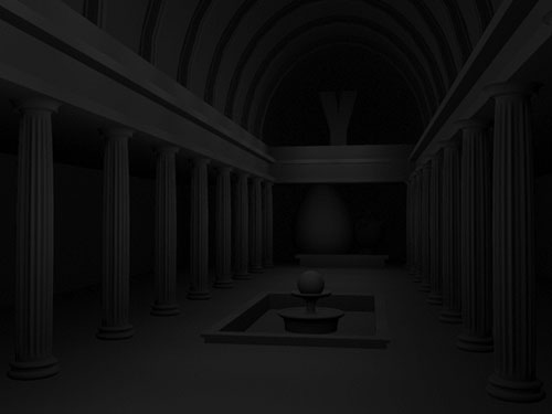 |
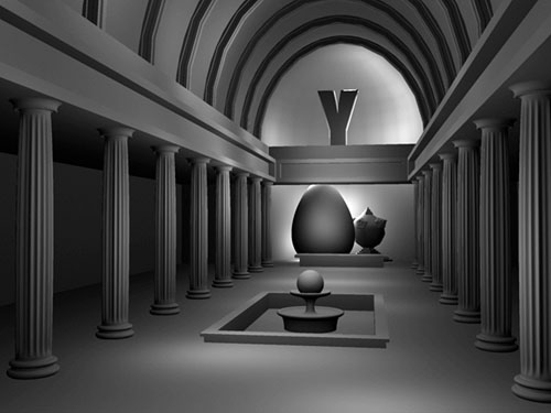
This shows that overall intensity is close. Note the problems with the lights being too close to balcony and you can easily see where they are located. Also since the lights are all the same height, the lighting effect on the pillars is the same and very symmetrical. Boring.... NOTE, that once again we are just using a simple lambert white shader on everything. This allows for fast renders and we can quickly see how the light is working. |
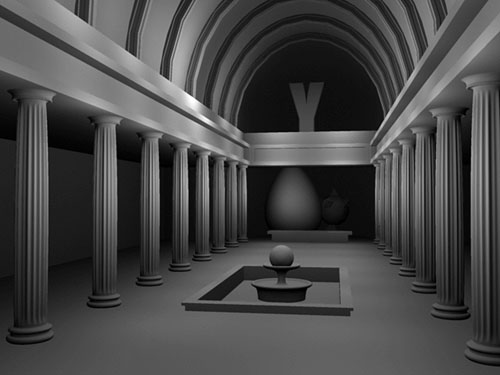 |
Lights have been tweaked and randomized. The hallway is much smoother and there are interesting pools of lights. The dome part of the space has also been roughly laid out.
|
 |
| Compare the arrangement of the lights in this layout with the first one above. You can easily see how they have all been moved to create areas of lightness and darkness. | 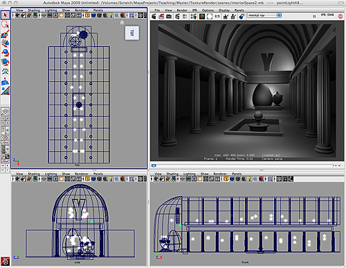 |
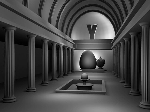
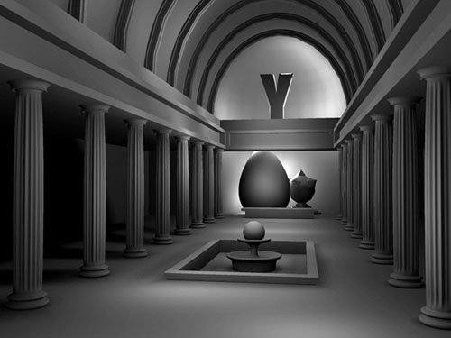
Time for shadows, but DON'T TURN SHADOWS ON THE POINT LIGHTS! Point lights use 6 depthmaps for shadows. It would a huge hit on render times to use these lights to cast shadows. In this demo, we will use other alternative methods for creating shadows. In this render you can see that there are now shadows at the foot of each column, around the pool, fountain, and bench in the far distance. These are all done with transparent planes. This is a method for doing real-time shadows. |
 |
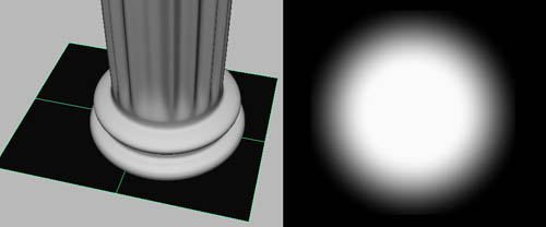
A plane is created with a ramp texture on the transparency channel. The color is set to black and in render stats the plane has to been set so it doesn't cast shadows. Make sure you are using a lambert with no specular or reflections. Position it under each column. A square one was made for the pool and bench. |
 |
Finally a Shadow Light is created and put up high in the ceiling so it casts some subtle shadows for one side of the columns and helps make the space behind them darker. This render took less than 30 seconds! And it contains more that 50 lights. Only one of them is casting shadows. A few more shadow lights could be added. The sculptural elements in the dome need a few more lights. Add in the textures and do final tweaking. |
 |
UMBC Department of Visual Arts, Advanced Maya Courses, Dan Bailey