ASSIGNMENTS |
|
1|
|
ORGANIC RHYTHM |
| Typography as an Abstraction | |
3.1
| |
Warner Bros. PROJECT ( P a rt 1) Introducing Images as Composition and Content |
3.2
| |
PHOTOMONTAGE Warner Brothers ( Pa rt 2) Introducing Images as Composition and Content |
| 4
| |
Exercises in Relativity Color :: Figure ground |
5
| |
Exercises in Relativity Color Theory :: Boundaries |
6
| |
Exercises in Relativity Color Theory :: Value, intensity |
7
| |
COLOR COMPOSITION (part 2) Optical Blending |
8
| |
COLOR COMPOS ITION (part 2) FRAMING LOCAL COLOR |
| paper | |
10
| |
required to attend all visiting artist talks |
ORGANIC RHYTHM
OBJECTIVE
To create Black, White and Gray, organic composition. Students will explore the principles of composition through architectual studies of Bauhaus and Purism including; rhythm, unity, balance, scale change, cropping, emphasis, focal point, implied line, asymmetry, negative space as positive. All compositions must be asymmetrical with balance, considering negative space and the compositional frame (4 edges). Proficiency of t-square and triangle will be introduced.
Compositional Objectives
1. Organic Rhythm: asymmetrical rhythm with variety. Using only organic (biomorphic) forms, create uniformity from similar forms without creating a pattern. Use positive forms to bring out negative shapes.
2. Organic and Geometric Unity: Create a harmonious balance between organic and geometric forms. Experiment with negative forms between each shape to develop a single shape with both organic and geometric qualities. Consider negative space, balance and asymmetry.
3. Linear Diagonal: create a dynamic composition based on lines. Consider negative space, diagonals, balance and asymmetry.
4. Scale Change: create a proportionally balanced composition based on dramatic scale change. Use as many geometric and/or shapes as desired, but include a single shape displayed twice, exaggerating its scale difference. Consider negative space, balance and asymmetry.
SUPPLIES Illustration board (must be 2-ply/heavyweight); HB pencil/eraser and sharpener; 2 sheets of Canson paper: black and gray; X-Acto knife, blades; cutting board; Elmers glue; flat brush; small dish; 24‰ t-square; 20‰ triangle; Sharpie marker.
METHODS
Prepare the poster board (note two size versions that are acceptable below) by using a t-square and triangle to draw. Finish by outlining the 7x10" or 8X10" rectangles with a Sharpie Marker, and erase extra pencil lines In pencil neatly mark below each 7x10 or 8X10 rectangle with the compositional objective
Step 2. Cut and Glue. Begin with the first composition. Choose the type of organic form you will work with and cut a variety of forms from both the gray and black Canson paper. Arrange a variety of possible compositions. Use the Elmers glue (the small jar, and flat brush to glue) .
40 thumbnail drawings in sketchbook & rough finals to be on 16 X 20 white Bristal or other quality paper- refer to calendar for due dates.
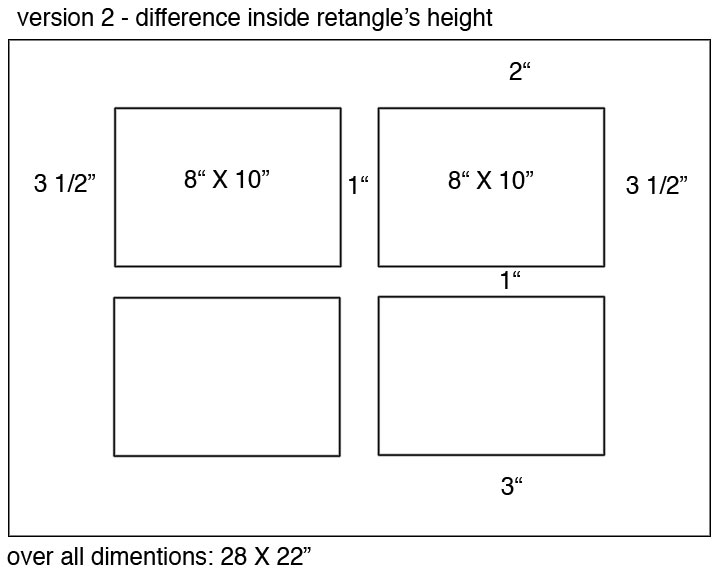 |
Note inside rectangles are 8" X 10 |
||||||||||||||
|
|||||||||||||||
| Typography
as an Abstraction OBJECTIVE Students will continue to study compositional principles with the introduction of 1) typography as an abstraction; 2) the grid as a formal tool, and 3) texture as an additional compositional element. An understanding of the golden mean and golden section for creating proportion will be introduced. Students will continue to create asymmetrical patterns and explore how negative space can be used as positive space while being introduced to the rhythms and consistencies of typographic anatomy. Students will not use typography as a unit for reading, but rather work exclusively in the realm of letters as abstraction in order to fully objectifying typography graphically. Individual balance will be achieved through the study of both individual small elements and an overall compositional grid. SUPPLIES 22x28 Poster Board (white or black, must be 2-ply); HB pencil/eraser; 1-2 sheets of Canson black; X-Acto knife, xtra blades; cutting board; Elmer’s Glue; flat brush; glue jar (provided); t-square and triangle; drafting tape; newspaper; black spray paint (provided). METHODS 1. Choose one of two grid layouts provided below. Use the poster board, t-square and triangle to layout the grid as described in the below diagram. Use pencil only (no sharpie marker). Use Scotch Drafting Tape around your two-inch border (3” on the bottom). 2. Cut black Canson paper into 12 6x6” squares. Choose one of the provided font/typefaces for creating a patter n. Use any combination of letters from a single font/font family. Draw only a portion of three letters per square, cropping each letter as you work. For each 6x6” square create a balanced, abstract composition. Save the positive letters and the negative black squares. Cut all squares before proceeding to the next instruction. 3. Use your grid as a guide for composing positive and negative forms. 6x6” square may be cut horizontally or vertically in order to fit the grid. 4. Use your positive and negative forms, newsprint, and spray paint, drafting tape, to form a mask for the placement of texture. Tape down where you don’t want texture.
click on image to view a larger resolution image. Print it out and put in your sketchbook for later reference. 40 thumbnail drawings in sketchbook & rough finals to be on 16 X 20 white Bristal or other quality paper- refer to calendar for due dates. |
||||||
| typography
archetecture [1]
[2]
[3]
[4]
Golden Mean and Golden Section [1] [2] [3] [4] [5] [6] [7] [8] [9] [10] [11] [12] [13] [14] student work colleage [1] creative uses of typography [1] [2] [3] [4] |
||||||
examples [1] [2] [3]
Warner Bros. PROJECT ( Part 1)
Introducing Images as Composition and Content
Attached is a Warner Brothers cartoon still containing an “action.”
For homework research the following:
1. What is that action?
Type a sentence describing the main action in the cartoon. Follow the sentence with a list of possible actions, or verbs appropriate to that action. hint: think broadly.
2. Find a documentary image naming that action. Search the media (newspaper or magazines) or history books for a documentary image that describes the cartoons’ action (or verbs). Make sure your image is factual (not fictional, staged or illustrated).
Do not use ads.
Note: Internet images are too small for this project, if you feel an Internet image is appropriate YOU MUST ALSO SUBMIT AN IMAGE FROM HARD COPY MEDIA (a magazine or newspaper).
| Submit:
1 page, 8 1/2” x 11” photocopy. The photocopy will contain: one sentence list of verbs (actions) photocopy of Warner Brothers cartoon (Bugs Bunny) photocopy of found media image Due: beginning of class, October 13 |
 |
| PHOTOMONTAGE
Warner Brothers ( Pa rt 2) Introducing Images as Composition and Content OBJECTIVE Using negative space positively, high/low contrast, cropping, knockout, abstraction, scale change, texture, asymmetry and balance, rhythm and variety into a well crafted black and white composition (color optional). Create a visual rhyme between a fictional and non-fictional image. MATERIALS Poster Board, 2-ply only; or Mat Board (either Snow White #3290; French Buff #3291; Antique White #3293; Arctic White #3297), Canson- black and 1 color (or Canford Paper); X-acto Knife, Elmer’s Glue, Spray Paint (provided), brush, drafting tape, pencil, sketch book, media image, Warner Brothers image (provided), photocopying (see methods). METHODS 1. Sketch books: create 12 compositional thumbnail concepts (four per page). Due: Oct 26 2. Photocopy: both the Warner Brothers cartoon and the media image experimenting with these techniques: a-cropping (to the verge of being recognized) b-abstraction (for a desired texture) c-enlarging (400% then 400% again) d-high contrast - use text setting and reduce the image to 25% at least once, then enlarge again - or use a light setting to knockout light values, re-copy with normal setting - use white out and black sharpie marker to fill in contrasts - use x-acto knife, scissors, white and black paper to fill in contrasts in large areas e-low contrast (lower the contrast setting to 1 or 0, use photo setting, re-copy on this setting multiple times) f-for a ghost effect of a high contrast image (follow instructions for d-, then e-) g-knockout (use x-acto knife, white out, etc.) Due: 3. Compose photocopies, Canson paper forms, spray texture into a well crafted composition from sketches following the project objectives. Completed Photomontage Composition Use one of the following compositional formates: 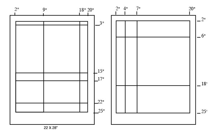 or
or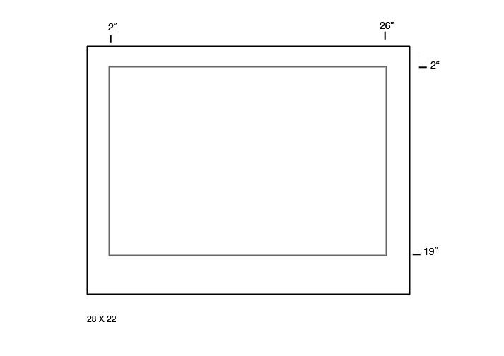 |
[1] [2] [3] [4] [5]
OBJECTIVE:
To learn color vocabulary and understand the subtractive color wheel and the relative characteristics of color according to theories by Bauhaus, Johannes Itten and Joseph Albers. Students will apply the theory of color pushing and pulling to their own compositions. They will need to distinguish hue, saturation, and value in order to successfully complete this exercise.
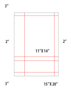
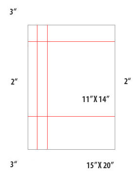
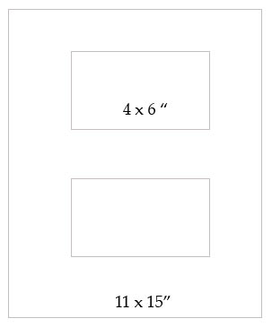
METHODS: Students will use 1 11x15” illustrations board, creating 2 4x6” compositions, X-acto knife, glue, cutting board, t-square and triangle, pencil, sharpener and eraser, and a box of Color-Aid, 314 sheets color package, 4x6”. Use the Joseph Albers “Interaction of Color” in the computer lab, chapter VI and VII for examples of finished student projects.
PROJECT:
Create 2 side by side figure/ground relationships in order to apply the following theories.
1. 1 color appears as 2 colors*
Utilizing the theory studied in Albers Interaction by Design, create two side-by-side compositions in which the same figure color appears as two distinct colors in each of their relative grounds. Label the composition 1 color appears as 2 colors (insert color harmony/or color scheme in the label) Hint: Look at the Interaction of Color on the computer and study the following: What is the relationship between the single figure to the two grounds?
2. 2 colors appear as 1 color*
Utilizing the theory studied by Albers Interaction by Design, create two side-by-side compositions in which two distinct figure colors appear to be the same color within their relative ground. Label the composition 2 colors appear as 1 color (insert color harmony/or color scheme in the label) Hint: Look at the Interaction of Color on the computer and study the following: In most of the examples, what is the relationship of the two grounds to each other? In most of the examples, what is the relationship of each figure to its ground?
|
 |
||||
include
lable typeset at the bottom of each comp |

OBJECTIVE:
To learn color vocabulary and understand the subtractive color wheel and the relative characteristics of color according to theories by Bauhaus, Johannes Itten and Joseph Albers. Students will apply this theory to their own compositions distinguishing hue, saturation, value and color relationships on the color wheel. All compositions will continue to be objective, abstract in form, utilizing issues of balance, negative space, etc
.
METHODS:
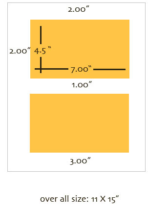
Students will use 1 11x15” illustrations board, creating 2 4x6” compositions per board (see reverse for sample diagram), X-acto knife, glue, cutting board, t-square and triangle, pencil, sharpener and
eraser, and a box of Color-Aid, 314 sheets color package, 4x6”.
PROJECT:
Students will create side-by-side compositions with the following objectives:
1. Vibrating boundaries
Create a composition that utilizes the theory studied in Albers Interaction by Design to create a color composition that vibrates Label the composition Vibrating boundaries.
2. Disappearing boundaries
Create a second composition where the boundaries are barely distinguishable. Label the composition Disappearing boundaries
|
||||
 |
 |
|||
| hue
as value |
how
much to how much |
transparency |
||
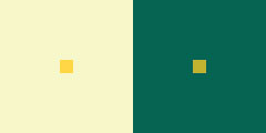
1. Select a hue of approximately middle value and cut three three- inch squares which are down on a horizontal line. (note illustration)
2. Select a second hue which contrasts with the first one, and cut three one and one-half-inch squares. Position the squares over one corner of the larger squares creating a one-inch overlap.
3. In the squares on the left, create the illusion of the smaller square being in front of the larger one by selecting a third, totally different, hue for the one by one-inch overlap. It is the boundary principle that determines what is in front and what is in back, not the choice of hue.
4. On the second set of squares, create the illusion of the larger and smaller squares merging.
5. On the far right set of squares, create the illusion of the larger square being in front of the smaller one.
6. Craft is an important criterion in evaluating this exercise.
![]()
OBJECTIVE:
To learn color vocabulary and understand the subtractive color wheel and the relative characteristics of color according to theories by Bauhaus, Johannes Itten and Joseph Albers. Students will apply this theory to their own compositions distinguishing hue, saturation, value, warm and cool colors, triadic and complementary harmonies. All compositions will continue to be objective, abstract in form, utilizing issues of balance, negative space, etc.
METHODS:
Students will use 1 11X15” illustrations board, creating 2 4x6 compositions per board (see reverse for sample diagram), X-acto knife, glue, cutting board, t-square and triangle, pencil, sharpener and eraser, and a box of Color-Aid, 314 sheets color package, 4x6”.
PROJECT:
Create side by side compositions, one of the compositions should be triadic and both will have the following criteria:
1. Equal hue value (brightness), different intensities
Create a composition where the value (brightness) of at least three colors is the same. Select a value within the scale of values provided by Color-Aid. Choose a value that is one step up and one step down (darker and lighter) from your chosen value. Match colors to the gray value, not to each other. Label the composition Equal hue value
2. Equal hue intensity (saturation), different values
Do not use full saturation hues, choose a combination of tints and shades. Create a composition where the intensity (saturation) of at least three colors is the same. Choose 1 or 2 colors along the same row of your color chart, or use your eye (and check it against the chart) and then select 1 or more of the same saturation from the shades. Use your eye, compare many steps when deciding equal saturation but different values. Label the composition Equal hue intensity
additive color [1]
psychology and color [1]
examples [1] [2] [3]
FRAMING LOCAL COLOR
Due Date: December 6
OBJECTIVE
To apply principles of composition through positioning a point of view within a frame. Additionally students will consider the natural world through framing color palettes and see the distinction between local color appearances and subjective color assumptions.
MATERIALS
Disposable Camera (or other camera where the student can produce 24 photos in a one hour photo processing lab). No inkjets or computer output will be accepted for this project.
Hint: avoid using figures or portraits as a focal point. No Sunsets.
METHODS
Shoot 24 photographs outdoors. The frame of the photographs must consider principals of composition, asymmetry, balance, rhythm, figure/ground relationships, etc. Each of the following color palettes should dominate one of the 24 frames:
neutral
monochromatic
analogous
warm
cool
complementary
split complementary
triadic
primaries
secondaries
tertiaries
Dimensions: 24 4x6” photographs developed at a 1 hour processing shop, mark on back your name and the principals color from the above list.
Begin collecting magazines to be used for the next assignment.
COLOR
COMPOSITION
Optical Blending collage
OBJECTIVE
To apply the color theory learned by Joseph Albers into a full color collage
from a photograph.
Students will train their eyes to interpret color between materials, they
will be able to deconstruct local color through the juxtaposition of its
color properties. Students will optically deconstruct their photographs
and visually blend near material to create an optical effect similar to
the original
image in composition and color.
MATERIALS
Students will use 1 15x20” illustrations board, creating 1 11x15”
composition, X-acto knife, glue, cutting board, t-square and triangle,
pencil, sharpener and eraser, a magazine and scraps from their box of
Color-Aid.
METHODS
Choose one of the 24 photographs to reproduce as a collage. Look through
magazines to find color necessary for your collage. You may visually blend
color, for instance, if a light gray is in the composition a paragraph
of black text on a white ground may visually blend to appear the same
value as the gray in the photograph. Use scraps of Color-Aid in addition
to magazines scraps.
Paper - review.
The critique paper objectives are to attend 2 or more art exhibition/ artist lecture and write a two page using word processing. First begin by describing the exhibition. How does the title of the exhibition inform the work exhibited? Who is the target audience? Pick out two works in the exhibition to compare and contrast with one another. Begin by describing the materials used, working your way to the content. Name outside influences if appropriate and how the works relate to one another. Discuss how the form and content work together. Does the works educate or entertain, or both? How? How does the work make you feel? Site an example of a critical review that you used as a model. Such as READ something from New Yorker, The Village Voice or the Washington Post.