This week we will spend less time on the mechanics of downloading and graphing data and more on trying to understand some fundamentals about the earth's energy balance. You should begin by reading chapters 4 and 5 in their entirety, as indicated on the syllabus. Read chapter 4 for Tuesday's class and chapter 5 for Thursday's class. The first, long part of this assignment is NOT REQUIRED but explains some of what we will be doing in class.
Pages 87-93 focus on the different forms of energy and the ways they are transmitted in the atmosphere or at the earth's surface. Pages 93-97 address the energy balance or energy budget for both shortwave and longwave radiation. It is important to distinguish between radiant energy and energy that has been absorbed and transformed into heat, which may take the form of either sensible heat (H) or latent heat (LE). The summary diagram in figure 4-11 illustrates how the entire budget can be balanced for the earth as a whole. As figure 4-13 shows, however, there are latitudinal variations in the balance that lead to poleward transport of energy through the circulation of the atmosphere and oceans.
Pages 97-103 focus on understanding the local energy balance and the
concept of net radiation. This is calculated by summing up all of the incoming
and outgoing (or downwelling and upwelling) shortwave (solar) and longwave
(terrestrial) radiation. The part that has been absorbed and turned into
heat energy is not included in this balance; actually, net radiation is
what is left after you have subtracted all outgoing radiation from all
incoming radiation, and therefore net radiation is what is available to
be converted into heat energy. That heat energy may take three forms: latent
heat (associated with melting of ice or, most commonly, evaporation of
water), sensible heat (associated with temperature change), and ground
heating and cooling (which we usually neglect as it tends to balance out
to zero over time).
If you compare figure 4-4 (global insolation) with figure 4-17 (global
net radiation), you will find that the places with the highest insolation
are not necessarily the places with the highest net radiation. Furthermore
the global patterns of latent heat (figure 4-18) and sensible heat (figure
4-19) are very different from each other. This will be discussed in class.
1. The components of net radiation and the daily cycle of radiation as it relates to the daily cycle of temperature will be explored on Tuesday in class by looking at the web site of the SURFRAD (surface radiation) network, which provides detailed field measurements of each component at locations from different climatic regions of the U.S. We will use the following procedure. You may try this on your own in advance if you wish; it is relatively easy and should take no more than about 15 minutes.
[Note: the graphs shown at this site all have the same time base; rather than local time, it uses UTC. The major drawback is that you are not seeing a complete daily cycle. Instead the graph begins with the tail end of the previous day, then shows the nighttime portion of the cycle, and then the daytime portion of the current day, but only up through late afternoon. If you want to see the rest you have to look at the next day's graph. However for days with relatively stable conditions and sunny weather, this will make less of a difference.]
3. On Thursday in class we will look at patterns of temperature change over time from individual stations, and we will compare these patterns for different geographic locations. In addition we will look at global temperature distributions and try to explain them in terms of the factors discussed in chapter 5.
Your required assignment for Thursday is to read chapter 5 in its entirety. We will do the investigative work in class and you will be asked to write up the results to be turned in by the following Tuesday. What follows is a description of the activities to be completed in class.
Pick a latitude for comparative study. Locate at least one continental and one maritime location at or close to the same latitude. If you're ambitious you might choose one west-coast location and one east-coast location as well as a continental interior location. This does not have to be limited to sites in the U.S.; there are both U.S. and global data sets available.
You may also choose a pair of stations at different latitudes but comparable maritime or continental interior locations, if you so desire.
Visit the Web site entitled "NCDC
Climate Visualization". Under the heading CLIMVIS Graphics Choices,
you will see options for both National Weather Service Summary of the Day
and Global Summary of the Day. Pick whichever one is appropriate. You have
the choice of plotting a time series or a contour map. Start with a time
series option. Select the option that allows you to plot one parameter
for a month from two separate stations in the same region or in separate
regions. Pick your stations and plot both stations together on the same
graph for a summer month and a winter month. (For the summer month pick
either mean or maximum daily temperature; for the winter month pick either
mean or minimum daily temperature.) Comment on any patterns that strike
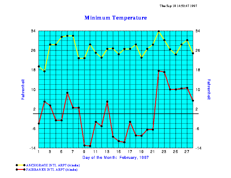
you as interesting or noteworthy. (For example, I tried doing this with
Anchorage and Fairbanks, both in Alaska, using the minimum temperature
for February 1997. The results are shown below. I also tried comparing
Asahikawa, Japan with Zamin Ude, Mongolia. Those results are not shown
here; you can look them up for yourself if you wish.)
Afterwards, go back and try a different graph type: "display the period
of record for one parameter at one station" (only works for U.S. stations)
or "display one parameter for a specified time frame" (up to one year;
works for U.S. and global data sets). You can use this to plot temporal
variations in maximum, mean, or minimum temperatures to show seasonal cycles.
In the case of the U.S. data set you can also see multiple years laid out
in sequence and get a real feel for year-to-year variation in temperature
patterns. Do this for at least two stations, preferably the ones you have
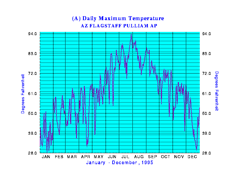
already been looking at. (Here's an example: I compared maximum daily
temperature at Phoenix and Flagstaff, Arizona for the period January-December
1995. If you want to make this kind of comparison for non-U.S. stations,
you need to choose the "Global Historical Climatological Network Data"
option.)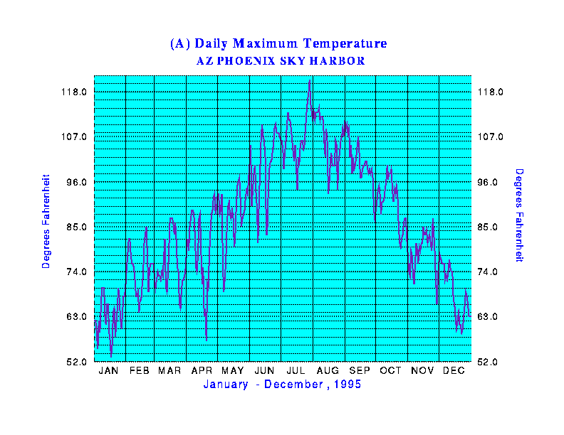
You can also make contour plots illustrating spatial patterns of climatic variables across the U.S. for specified dates. You might want to try experimenting with this as the contour plots may help to understand the relationship between the temperature trends at the two stations you picked earlier (only works if they are both continental U.S. stations. This is not required.)
Write up some general comments on how the observed patterns do or don't conform to what you would expect based on the book's discussion of factors affecting both seasonal patterns and spatial patterns of global temperature.
Next go to the "SSEC
Sea Surface Temperatures" Web site and go to "Latest SST". This
is a beautiful color image showing the global distribution of sea-surface
temperature. It is updated daily. There is an archive containing daily
images for the last two weeks, but unfortunately this site doesn't retain
images for long enough to compare patterns showing seasonal changes. Another
site sponsored by NOAA does contain monthly
SST images for the period between 1984 and 1996. Look here in order
to see whether you can pick up any significant changes between images taken
a few months apart. How do they relate to the patterns you observed
in the annual cycle of the net radiation balance? (This is a slow site;
if the images take too long to load, don't worry about it.) Another, faster
site with monthly SST images based on long-term average conditions is NOAA's
"Live access to climate data." Note in particular that although
temperature varies mostly with latitude, there are significant anomalies
that clearly are affected by factors other than latitude. This shows up
as well in the following animation.
You can also try looking at the animated
view of sea-surface temperatures for the North Atlantic. This will
show you the seasonal cycle of changing temperatures over a span of about
1.5 years. You can get a fascinating view of how temperatures reflect not
only seasonal cycles of the global radiation balance, but also the dynamics
of the ocean surface itself. Can you describe and explain the patterns
shown here?